
Tom Bonner
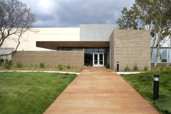
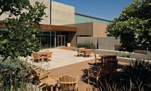
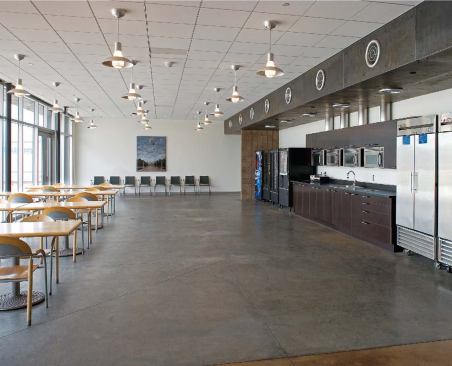
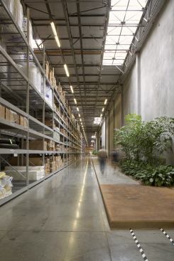
While it might be a stretch to characterize these gardens and lounges as “spiritual” spaces, their atmosphere transcends the standard warehouse interior. The client and Ehrlich’s office spent two months meeting with user groups to determine how to make this an enjoyable place to work. They looked to studies that show a correspondence between good work environments and increased productivity. The design also makes sense from a Taylorist point of view: Employees are able to sit for a moment to check their e-mail or eBay bids, rather than spend their short breaks trekking across the distribution floor.
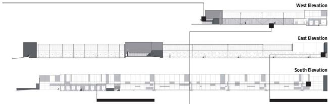
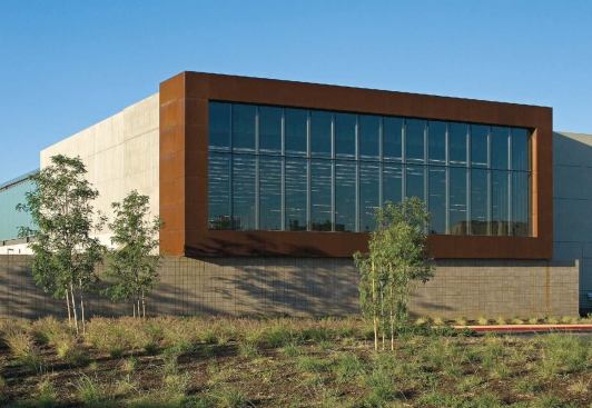
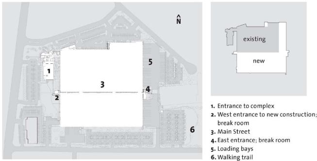
Delineating the divide between old and new construction, Main Street is the most expressive element in a straightforward floor plan. The 300,000-square-foot addition wraps the 1984 building in a lopsided L shape. Although the building is something of a cipher, the architects use the façades to their advantage. Each surface responds to interior functions. On the west side, the firm split the 38-foot-high façade into two bands: The top is a ribbon of insulated metal panels adorned with custom downspouts (to handle the runoff of a 200,000-square-foot roof), while the bottom skips from clear to fretted to channel glass.
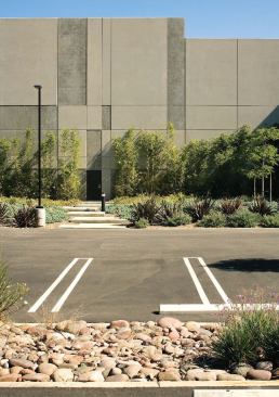
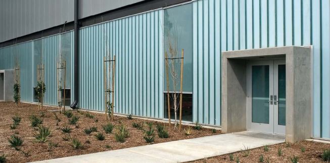
Forming stripes against the channel glass, the clear, vision-corrected glass rises only a few feet from the slab before switching to obscured panes. This allows for privacy and security while affording glimpses of the landscape from inside. The idea stemmed from the biotech research laboratory that Ehrlich’s firm completed in 2003 in Cambridge, Mass. Although the warehouse is a different building type housing a very different enterprise—employees stand at conveyor belts, not lab tables—workers’ needs and desires proved universal. “We learned from the biotech building that the scientists wanted a view to the outside,” Chaney explains. “We took that bit of shared knowledge to the warehouse.”
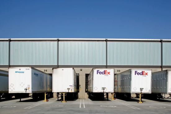
“This is our Donald Judd shot,” says Ehrlich, surveying a lineup of trucks parked along the eastern loading bays. The trailers repeat down the length of the façade, recalling that sculptor’s trademark boxy artworks. This side of the building is devoted to receiving shipments, with the exception of the eastern entry courtyard and break room. Forty-one loading bays are in continual use.
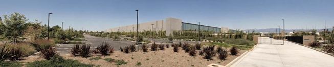
“The building is a machine,” Ehrlich continues. “As architects, we get turned on by all the bolts and gizmos, by all the technical parts.” The reductive palette of high modernism and minimalism clearly influences Ehrlich (who paraphrases Le Corbusier’s ode to function). He points to the translucent channel glass that spans most of the 820-foot-long façade, interrupted only by concrete sheer walls at the middle and two ends. The insulated glass planks allow diffused light to fill the interior, while keeping heat gain down.
“Now that’s a window,” he exclaims. “We were the first people to do channel glass in the United States, so we were confident in using that material. We are always looking for the right alignment of material and purpose—one that presents honesty, expressiveness, and appropriate function.”
Brooklyn, N.Y.–based Mimi Zeiger is the author of New Museums: Contemporary Museum Architecture Around the World.
PROJECT Warehouse expansion, Los Angeles
ARCHITECT Steven Ehrlich Architects, Culver City, Calif. (Thomas E. Zahlten, principal in charge; Steven Ehrlich, design principal; Mathew Chaney, architect; Patricia Rhee, designer; Becky Nix, Mark Kim, and Ricardo Moura, project team)
LANDSCAPE ARCHITECT Pamela Burton & Co., Santa Monica, Calif.
ENGINEER Arup, Los Angeles
LIGHTING DESIGN Horton Lees Brogden Lighting Design, Culver City
GENERAL CONTRACTOR (PHASE 1) Pepper Construction, Irvine, Calif.
GENERAL CONTRACTOR (PHASE 2) Matt Construction, Santa Fe Springs, Calif.
CLIENT Withheld by request