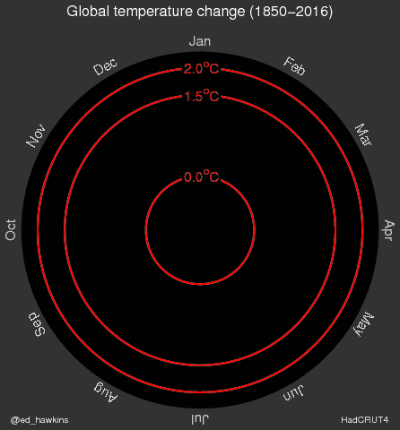
Ed Hawkins, a climate scientist at the University of Reading in the UK, recently created a GIF that visualizes the development of world temperatures ascending over the course of the past 66 years since 1850. The chart, shown below, once again proves the existence of global warming.
The point on Hawkins’ spiral below shows how much the average temperate deviates in a given month from the long-term norm between 1950 and 1900 (before industrialism’s debut in the 20th century). As shown in the illustration, rising global temperatures are not entirely predictable, with temperatures sometimes fluctuate significantly among adjacent years.
Another line chart made by Hawkins visualizes the numeric change in global temperatures over time.
This chart tracks down the temperature changes by month, and shows that the effects of global warming are most obvious during the Winter and early Spring, specifically in months between December and March.
Head over to VOX for more details.