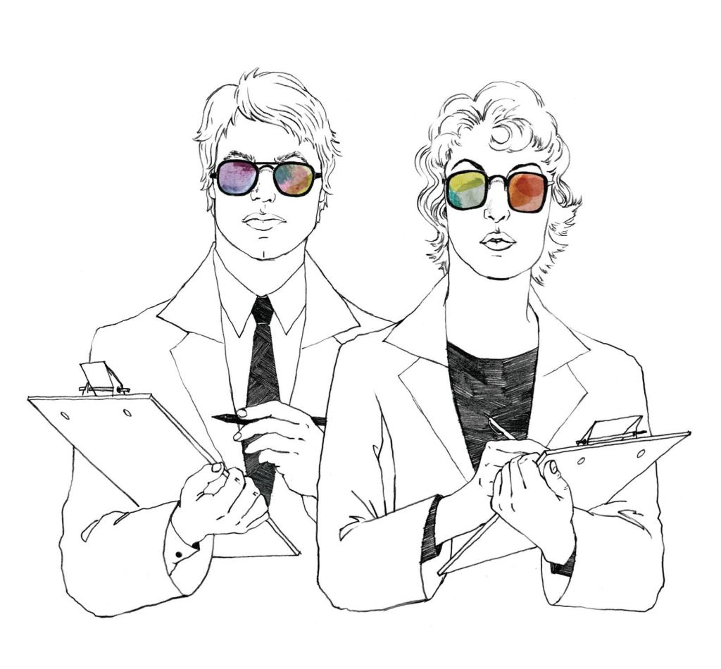
“We bring all our supporting materials—imagery, for the most part—from different resources, and then we bring the colors that we feel really tell this story,” Jordan says. “So each person goes around the table and does their presentation, and from that, we’ll start seeing [people say], ‘Oh yeah, I researched the same thing,’ or ‘Oh yeah, I have something very similar to this but I found it here.’ ”
International and regional design shows are one of the best sources for research, color forecasters agree, partially because they can provide a hint of shades or color combinations being tested or set to debut. “Years ago, I remember going to a show where they had rugs that were created and dyed in these very deep purple colors,” Mathew says. “They were hung on the wall because they weren’t really being sold yet. It tells you something about the direction of color that we’re going in. The following year, when I went back to the same show, I saw that those rugs were actually a part of their offering.”
Color trends can also be influenced by popular moments in culture or even broad economic trends. “The economy of late has been horrible, but it affects people in different ways,” Jordan says. “In the past, when there was a downturn in this economy, everything would get very gray, very brown, very neutral, because people didn’t want to spend money on something that was going to be a fad. Then there’s also this other mind-set that says, ‘You know what, I want to make my mood brighter and more cheerful by adding color to my space.’ ”
Star architects and designers can be trendsetters as well, says Josette Buisson, a marketing strategist on color for Pittsburgh-based PPG Industries, which manufactures products ranging from paints and coatings to architectural materials. “We call them the influencers,” Buisson says. Those influencers range from product designer Marcel Wanders and interior designer Kelly Wearstler to architects Zaha Hadid, Hon. FAIA, and the ever-influential Frank Lloyd Wright.
From these raw and diverse sources, the color forecasters begin to build a more refined set of palettes that tell an overarching story. These palettes tend to incorporate similar trends taking place simultaneously in areas such as fashion, design, and pop culture, Jordan says. Sherwin-Williams, for instance, is finalizing a set of four palettes for the company’s 2013 color forecast, set to launch at NeoCon in June. One, a dark, romantic, masculine palette, plays on themes of mystery and intrigue, inspired in part by the trend of pop-up restaurants and theaters that invite visitors to a secret location. The colors include dark burgundies and oxbloods, dark plums, and a very dark hunter green.
The stories behind the color palettes can be important in providing inspiration to designers. PPG identified five stories this year, including craftsmanship, inspired by a move toward artisan-made products, and illusion, a theme that relates to the popularity of fairy-tale fantasies and vampire stories. “It’s like we’re giving [designers] a beat, and then they will write their music out of it,” Buisson says. Portillo agrees that the narrative backstory behind a color trend can be a powerful tool for designers as a jumping-off point with their clients. “But,” she warns, “if it becomes prescriptive—that any time you want to have an Asian feeling, you need to use this palette—then it becomes very limiting, and it’s something that should be avoided at all costs.”
Whether the colors are inspired by an Italian furniture fair or an Estonian artisan, designers should look at the philosophy behind a company’s color selections and decide for themselves how it applies to their own project, Mathew says. “If we simply say that it’s one color that is the color of the year, it doesn’t help anyone, because it’s just a policy,” she says. “Creating a philosophy around color is so much more transformational, and I think that’s what we’re really after when we’re putting forth a trend.”
