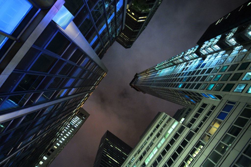
You can’t miss the tower. Arriving into New York, the modestly named 1,396-foot-high 432 Park Avenue rises above everything around it, a gridded tube abstracting and punctuating the more leaden masses of the lesser boxes around it. When I couldn’t sleep at night, there was 432 Park, the blue glow of the construction lights making it all the eerier. Looking down Park Avenue, there it was. Across town, its top was still visible. It is, as the developer claims, New York’s new icon.
Three things make it work. The first is that height. Not only is it taller than the Empire State Building—by about 40 percent, if you don’t count the spire—but it also rivals and tops, if you again don’t count the antenna, the Freedom Tower. The second is its location. Standing right in the middle of Manhattan, it commands the center of the island’s skyscraper ridge in a way that neither of its two rivals does. The third is the simplicity of its design. 432 Park Avenue is a completely square tube measuring 93 feet on each side, clad in concrete punctuated by square windows that make full use of each floor’s 12-foot height. There is no spire, no thickening or protrusion at the base (although the manipulation of that grid might still be the design’s Achilles heel once the boarding is off), nothing to mar the relentlessness of the structure. For once, design architect Rafael Viñoly, FAIA, who otherwise messes up most of his buildings with elements that are both too much and too weak, got it right.
Does that make 432 Park Avenue good? It is a question even the New York Times, whose architecture critic seems not to have noticed any of the new construction in midtown, has taken up. They are not sure about that clarity; I am. It is a refreshing alternative to the mediocrity of the buildings around it.
On the one hand, the tower’s very appearance represents the transformation of this and every other city into a place for the wealthy to live and play (the top apartment will cost more than $95 million), but on the other hand it does so with an elegance, borne out of its simplicity as much as its height, that make it clear that it is still possible to make an beautiful skyscraper.
It is certainly much better than the Freedom Tower, whose convoluted geometry comes down to a set of triangles, each far too elongated to make sense, fitting together over a bunker clad in translucent glass and ending abruptly to house that much-too-thin antenna. 432 Park Avenue is also better than any of the other skyscrapers that have been completed so far in Midtown.
When I visited the Ground Zero site, the importance of doing a good grid became evident again. Of all the towers there, the one that still makes the most sense is Skidmore, Owings, & Merrill’s now eight-year-old 7 World Trade Center. It is a simple box, its grid made all the more beautiful because of the way in which the spandrels, in a reversal of the usual hierarchy, are recessed. SOM always knew how to play with grids. Four World Trade Center by Fumihiko Maki, Hon. FAIA, also has a certain elegance, but the manner in which the architect sliced it with those dreaded dynamic diagonals ruins it for me.
My brief survey of Manhattan high-rises, in other words, brought out the modernist in me. Grids, abstraction, and the logical piling on top of the other of floor plates are good. Beyond that, God is in the detailing. Almost any manipulation of a high rise weakens the skyscraper, unless the architect uses old-fashioned setbacks to give the tower both a classical logic and a sense of soaring. Even responding to the street does not make sense in Manhattan’s grid. Just be there and be square. And be tall.
Aaron Betsky is a regularly featured columnist whose stories appear on this website each week. His views and conclusions are not necessarily those of ARCHITECT magazine nor of the American Institute of Architects.