25 of the Strangest Entries in the Guggenheim Helsinki Design Competition
Tomorrow brings with it the announcement of the winner of the design contest for the future Guggenheim Helsinki museum, but there are 1,714 other submissions that won't win. And some of them are really out there.
On Dec. 2, the Guggenheim released the shortlist of six designs chosen from a huge batch of 1,715 submissions for its Guggenheim Helsinki Design Competition, and tomorrow, the institution will announce the winner. That leaves 1,714 designs that didn’t win, all of which can be found on the competition website, some of which are … well, unique, to be nice about it.
So we took a little time and perused the mammoth listing to reveal some of the weirdest, oddest, and certainly most unique submissions in the catalog. We picked the 25 shown here, but out of nearly 2,000 entries, we probably skipped over a few of your favorites though, so let us know if we missed anything.
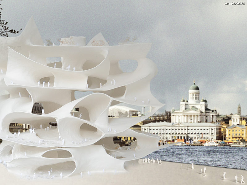
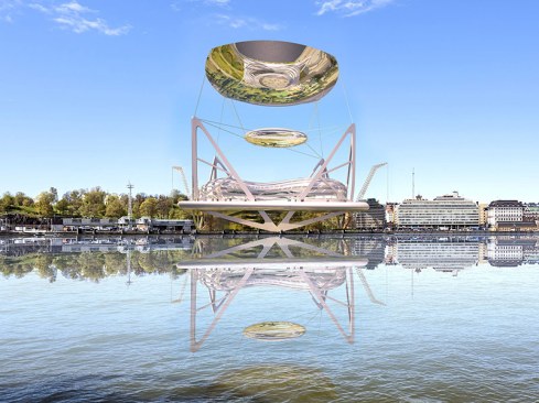
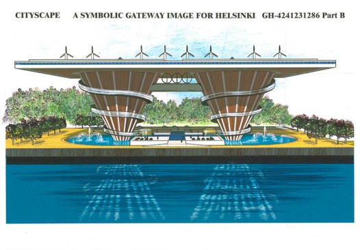
Per the design brief: THERE ARE NO CORNERS! (Their all caps, not ours. We promise.) It doesn’t look like there are any walls to prevent you from falling out an onto the plaza below either …
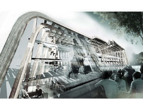
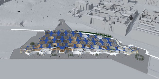
From the architects’ conceptual description: “The architecture may be PHENOMENARISTIC or RECIPRONARISTIC,
TIMELY or PLACE LOCI. Silent Voice-Architecture Loci’s act as organizing
devices common denominators for the multiple dimensions of programs and their
evolution over time, and drive the projects featured in works of CREATION for
Nature of SYNCHRONICITY.”
It looks like Mad Max and Imperator Furiosa are about to drive through the crowd. GH-2045459988 by Trinity Plus One PYT LTD
Some of the other angles of this project make it look like a perfectly normal, ordinary wooden box, but from this view, it looks like a popsicle-stick-model that is too thin in the middle and is about to snap in half.
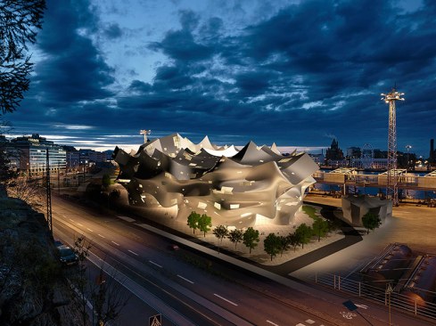
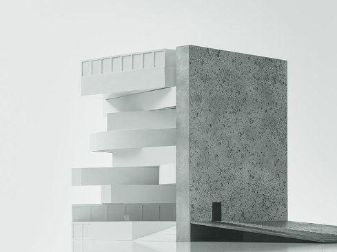
From the designers: “Today any kind of architectural design is possible but few are really desirable. The delirious visions of the so-called avant-garde arrive with a built in date of expiry and barely outlive their birth.” In reaction, their “timeless architecture,” apparently, ends up with a shape that looks like a chrome rear-projection TV.
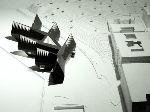
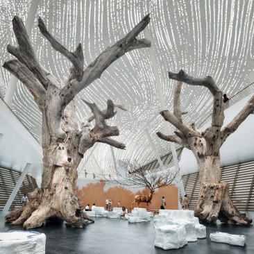
From the designers: “Our building wonders whether architecture too is like these boys somehow, or like the angel even [from Hugo Sinberg’s painting ‘The Wounded Angel,’ or otherwise like this story here, this theme, if that is what it is, this ideology or myth, this psychology, this reenactment or translation, this sense of hope or irony, this duty bound or just gain relief, this latent expectation, this suspicion or this reverence, this literalness or mysterious symbology.” GH-7637913420
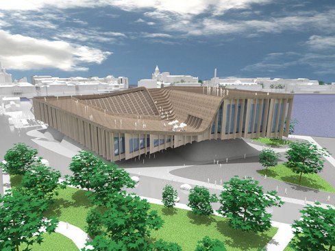
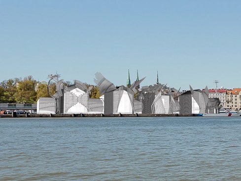
The design “borrows the typology of a traditional city block–Kortelli, and is rendered with surface charred wood reminiscent of a pre-fire Helsinki” with a whole lot of angelic imagery in the winged structures. Judging by this and the previous entry, there is lot of angelic imagery to go around, apparently.
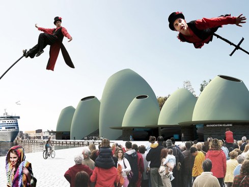
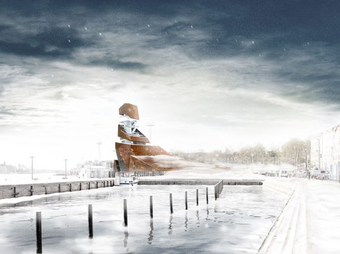
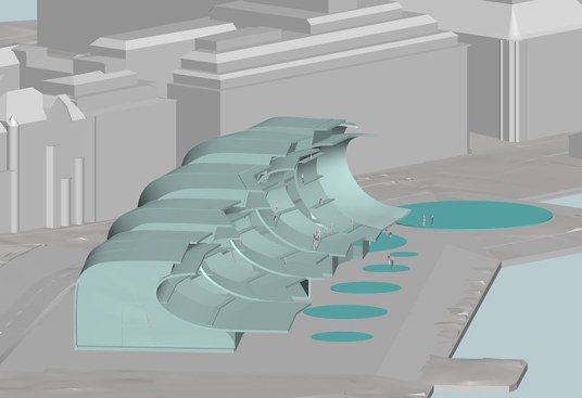
From the designers: “The main idea for this proposal is a kind of ‘wave,’ a cultural wave which comes from overseas with Guggenheim initiative. Same wave brings us all contemporary international trends of art and visual culture. Wave also stops friendly in the harbor and brings us fresh possibilities to represent Finnish art as well.” Sure …
Did we miss your favorite unusual submission in the Guggenheim Helsinki contest? PIease let us know in the comments section below or share it with us on social media.
Greig O'Brien is the former managing editor of ARCHITECT. He also held other titles in Hanley Wood's Design Group: Residential Architect and Architectural Lighting.
Caroline Massie is a former assistant editor of business, products, and technology at ARCHITECT and Architectural Lighting. She received a bachelor’s degree in American Studies and English from the University of Virginia. Her work has also appeared in The Cavalier Daily, Catalyst, Flavor, The Piedmont Virginian, and Old Town Crier. Follow her on Twitter at @caroline_massie.